Critique of the Fonts Used in FiveThirtyEight's Sumo Graphic

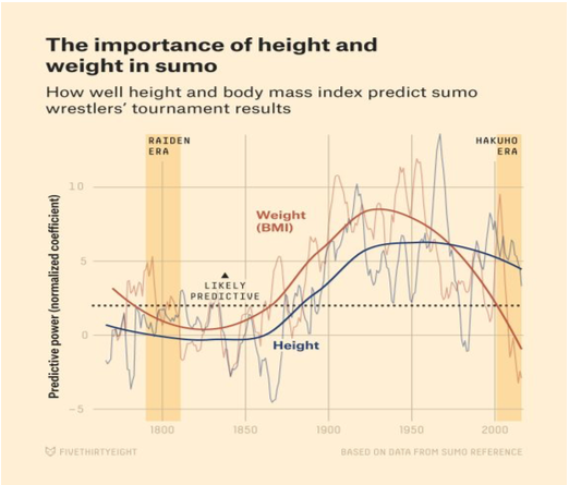
One of my favorite articles from 2016 came from Data-Journalism website, FiveThirtyEight and it analyzed the career of the greatest sumo wrestler of our time, Hakuho (his era is shown in the highlighted bar on the right of the graphic), with respect to one of the mostly highly respected sumo wrestlers of all time, Raiden (his era is shown in the highlighted bar on the left). The author, Benjamin Morris, performed his analysis using data from Sumo-Reference.com, which has detailed data dating back centuries. In this graphic, he pulled data relating to the wrestler's height, weight, and success in the ring.
One trait of most FiveThirtyEight graphics that I love is their headings. For the viewer, the first couple seconds of looking at most graphs involves confusion. But their headers, placed at the top and in bold, guide the viewer and its subtitle relates the goal of the graphic or the main question it is trying to answer.
Along with the summary header, FiveThirtyEight is very particular about what fonts they use in their graphics. The header and its subtitle are Atlas Grotesk Bold and Atlas Grotesk Thin respectively. They are perfect for text in graphics because they are sans serif and characterized by "relatively long ascenders but short descenders"(From the link above). First, sans serif is a font without serifs, as the name suggests. A serif is the extending feature, similar to a "tail", on a letter. For example, this is written in serif. Sans serif is the font style of choice for web journalism because the main benefit of serif fonts, readability, is nullified by the comparative lack of detail provided by pixels in computer screens to printing presses on books.
The other important characteristics of Atlas Grotesk mentioned- supra are its ascenders and descenders, most simply described as the amount of a lower-case letter than extends above the mean line and below the baseline of a font respectively. A useful graphic is shown below.

These characteristics combine to deliver a compact block of text that is readable but also does not interfere with the spacing of the actual point of the graphic, the graphic itself. The font used in the graphic to annotate the eras and the dotted line is called Decima Mono. As opposed to Atlas Grotesk, it has shorter ascenders and even shorter descenders. In this graphic, Morris only uses Capitalized Decima Mono in order to have clean, consistent, and therefore readable text within his graphic. If the font were to have long descenders they could interfere with the graphic by literally going over it or by drawing attention away. Once again, Morris uses Atlas Grotesk Bold for the "Weight" and "Height" labels. He could have used Decima Mono for the reasons above but then their colors would not be as visible. In typical FiveThirtyEight fashion, the axis labels are slightly transparent so as not to draw attention away from the graphic.
Morris and the other fantastic writers at FiveThirtyEight do an incredible, but under-appreciated job, with their font choice. In this graphic, he manages to subtly guide the viewer through without demanding attention away from the main subject.